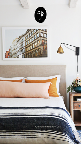
2024 Trends for Interior Home Paint Colors
From coastal blues to bold greens, color is one of the best ways to tell a story in a space! We love choosing a unique palette and using it throughout a home to define spaces, and create natural flow from room to room. Whether you like neutrals or bright colors, you’ll find plenty of ideas for how you can change up your space this year. We’ve rounded up the top 2024 trends for interior home paint colors!
Bring on the Blues
You can’t go wrong with a soft blue! There’s a reason this has been a popular shade for decades. Light blues bring feelings of calm and serenity while darker blues emit a moody feel and are great for small spaces.
Every year, you’ll find varying shades of blue on the list for color of the year. In 2024, Sherwin-Williams chose Upward, a pale, coastal blue that’s perfect for kitchen islands or bathrooms. Valspar’s pick Renew Blue is a blue-green reminiscent of natural elements like the sky and glacier lakes. It pairs well with some of their other neutral tones like Perfect Backdrop or Dusk in the Valley.
Benjamin Moore’s color for 2024 is Blue Nova, a vibrant blue with purple undertones. These three colors give you some good options if you’re looking to add some blue to your home this year!
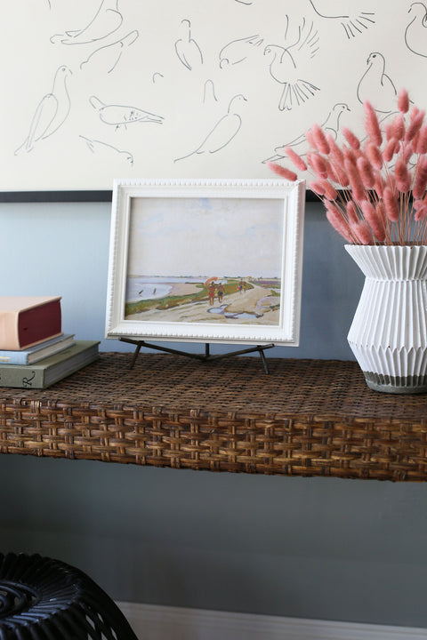
Our favorite light blue is Mount Saint Anne by Benjamin Moore.
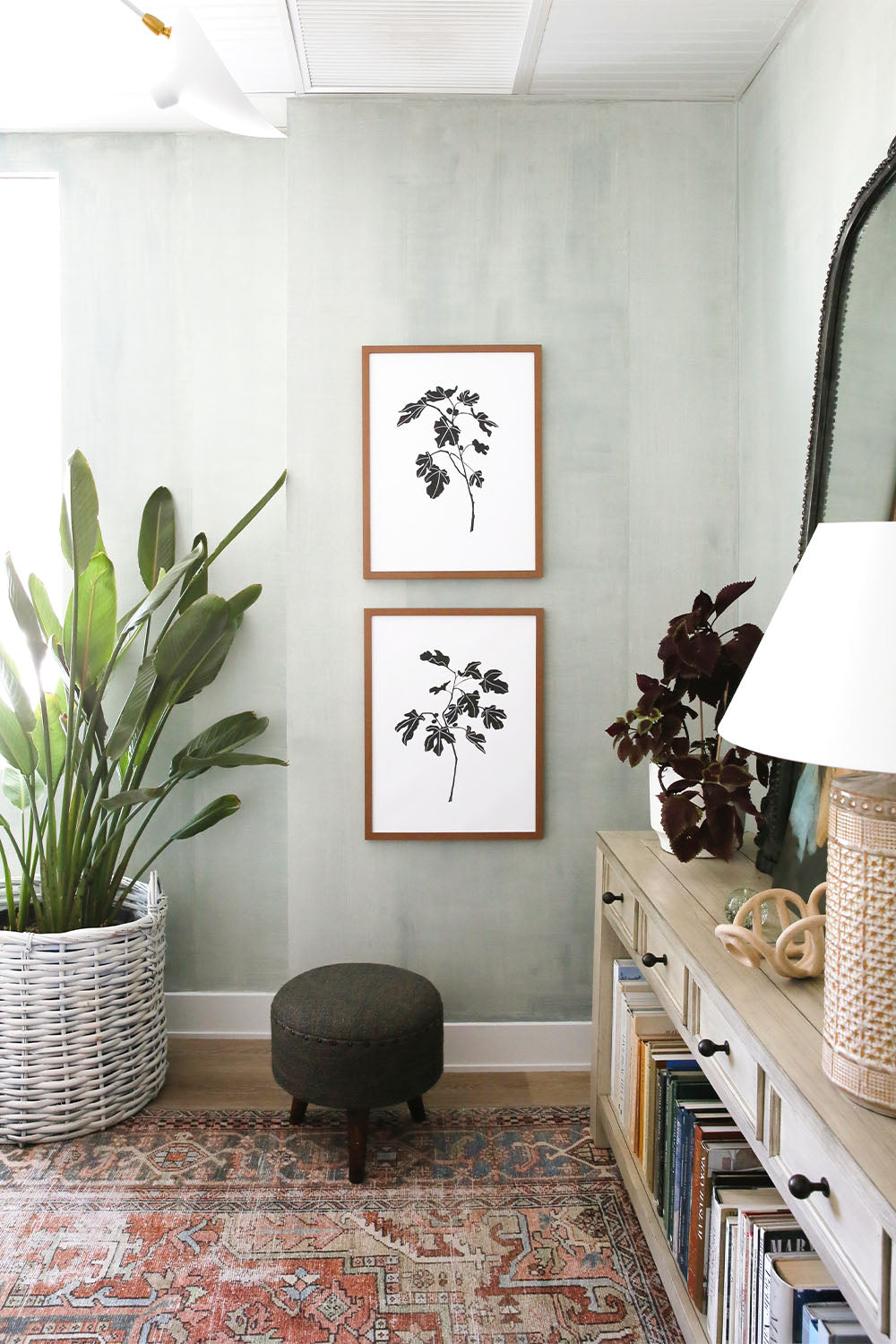
We also love Benjamin Moore Brewster Gray for a more blue-gray look. See it HERE.
Beige is Back
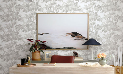
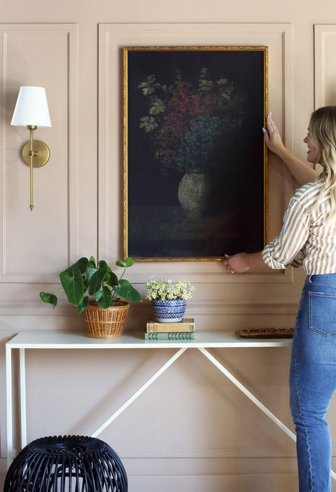
It may not be 2004, but beige is making a comeback. Maybe don’t go painting your entire house in this shade, but done in small increments beige can feel fresh and modern. It’s a nice warm step away from the stark white and cool grays we saw so much of in the last 5-7 years. It’s still neutral and can complement the greens and blues we all love. It’s also a great backdrop for your favorite artwork without distracting from the piece itself!
We recommend Shaker Beige or Bleeker Beige by Benjamin Moore and Playa Arenosa by Sherwin-Williams. Slipper Satin by Farrow & Ball is another great neutral. Keep in mind that many beiges can have yellow, green or pink undertones so it’s important to read the description on each of your options and sample them first.
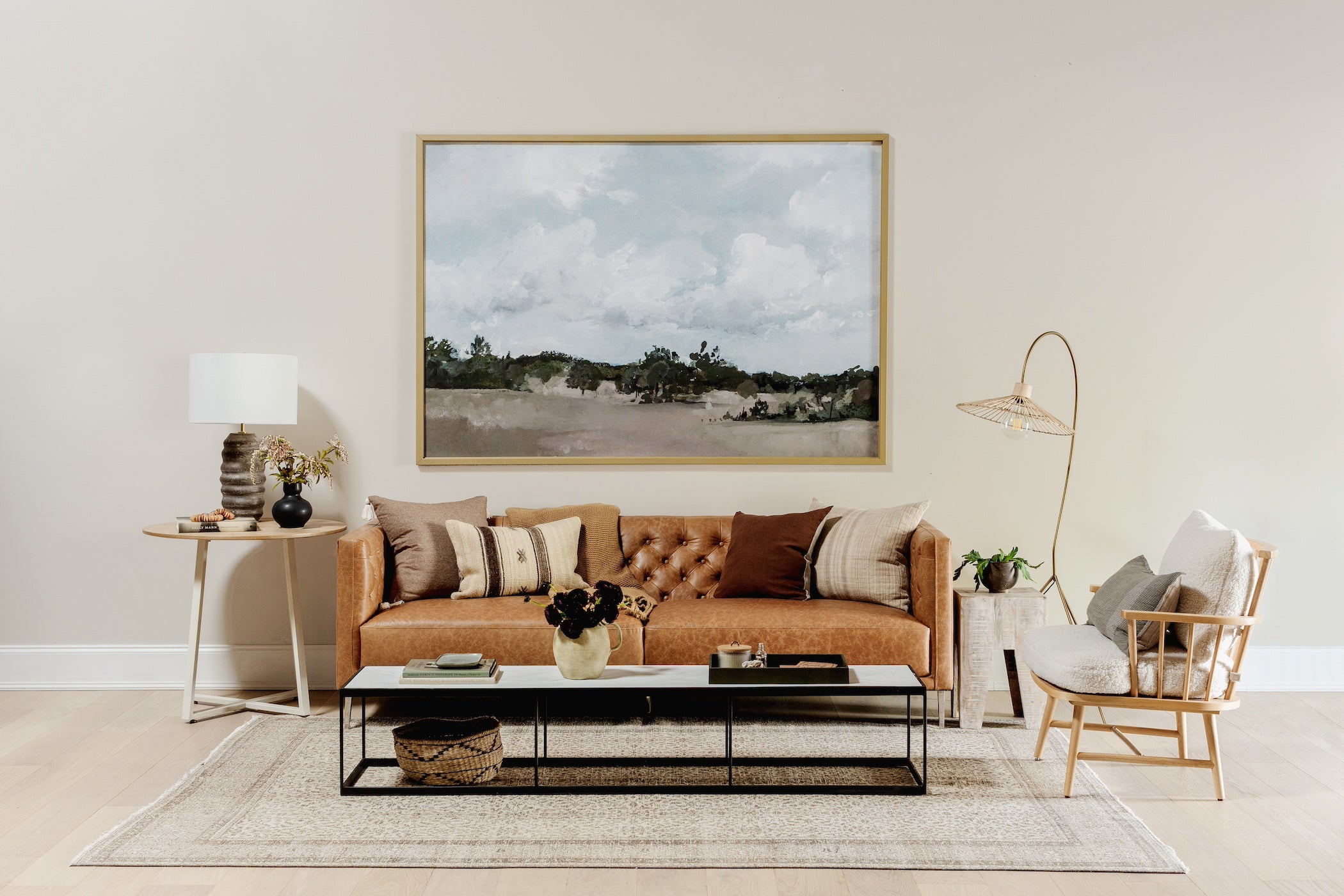
Pasture by Hannah Winters
Wall Color: Benjamin Moore - Pale Oak
More Chocolate, Please
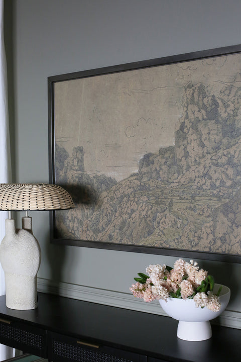
Dark chocolate browns like Tamarind by Benjamin Moore are like a warm hug. They make you want to curl up in front of the fireplace with a book and cozy blanket. Use this color in your library or dining room for an unexpected look!
As wood flooring trends toward lighter more natural stains, this rich brown brings in some contrast and warmth. It also brings out the earthy tones in some of our landscape art. We love the look of our Alaska print against Tamarind.

Warm Whites
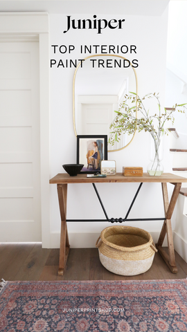
Shades of white, cream, and off-white will still be popular this year, they are classic and won’t be going away anytime soon! White makes a home feel large and open and we love using it to highlight a larger room. When combined with LED bulbs, white paint can sometimes make a home feel cold and stark, so consider selecting a white paint with a slightly warmer hue. Cotton Balls by Benjamin Moore has slight yellow undertones that give off a warm glow.
Simply White by Benjamin Moore is another popular choice for walls, trim and kitchen cabinets. It feels slightly warm but also pairs well with cooler shades. It’s a great backdrop for colorful art and furniture. For an off-white look, try Benjamin Moore’s Silver Satin. It has lavender-gray undertones but still remains a good neutral.
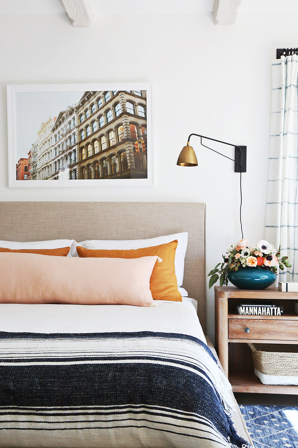
Benjamin Moore - Chantilly Lace
Green with Envy
Your house will be the envy of the neighborhood with green in the mix! For a bold option, Dutch Boy’s 2024 shade Ironside brings a rich earthy olive tone that’s perfect for showcasing your art or furniture.
Green is such a versatile color because there are so many shades. Dark greens can look almost black, while a pale sage green reads white from afar. Olive greens are appealing to many because of their warmth and earthy tones. We love Tate Olive by Benjamin Moore!
For a lighter green option, check out Rainwashed by Sherwin-Williams. It’s a serene, calming green that really pops against white trim in bathrooms and bedrooms. Pair it with brass hardware for a timeless look.
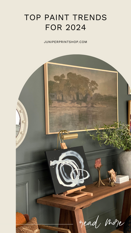
We love this dark green Jenny chose for her living room. It makes a bold statement and pairs well with gold frames! (Paint color: Dunn Edwards Carbon Dating)

Pinks
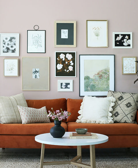
Pink isn’t just for Barbie these days! We love pink paint for bedrooms, offices and bathrooms. It elicits a fun and cheerful vibe. Pink can work as a neutral and it always goes well with white trim. Paired with greens, it reminds us of natural elements like roses and tulips.
Benjamin Moore’s Fruit Shake is a fun, statement pink with a brown base that’s great for accent walls and furniture. Another light pink shade is Demure by Sherwin-Williams, it’s a little more saturated without being overpowering
If you’re looking to make more of a statement with pink, consider Dead Salmon by Farrow & Ball. With a brown base, it has a deeper shade that’s great for accent walls and furniture.
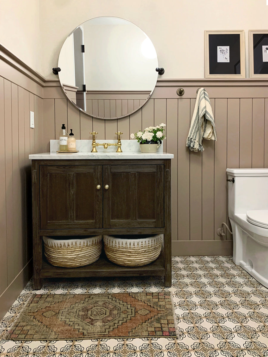
Farrow & Ball - Dead Salmon
Painting Tips
Remember it’s best to sample a few different paint colors before committing to one. You can paint a few swatches in different parts of the room and see how they look in daylight and at night. Alternatively, you could paint a few samples on a large poster board and move it around the room. Just keep in mind that the wall texture may alter the color slightly. Paint can darken as it dries so give it a day or two before deciding on your final color!
If you’re looking for more classic colors, check out Jenny’s tried and true favorites here: Jenny's Tried and True Paint Colors
2024 Trends for Interior Home Paint Colors
Paint is one of the easiest and least expensive ways to change up a room. If you’re looking to mix things up this year, try one of these popular colors to make a statement in your home! Follow Juniper on Instagram and TikTok for more design inspiration. And be sure to tag us when you hang one of our prints on your wall!
