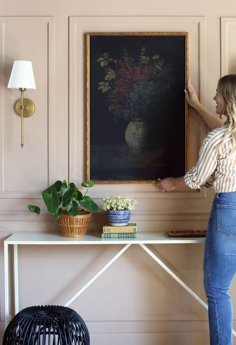


HOW TO PICK THE PERFECT FRAME FOR YOUR SPACE
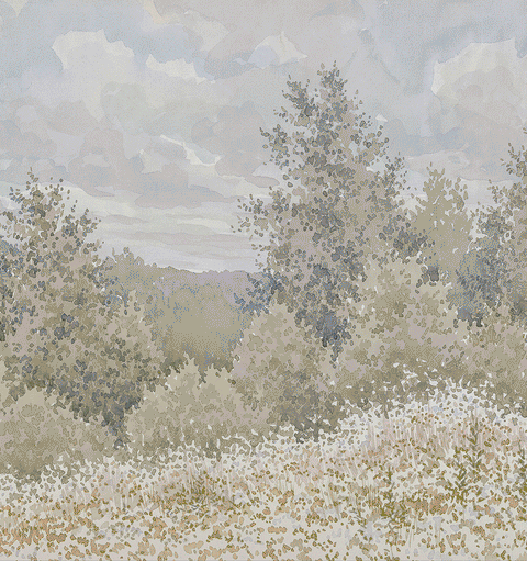
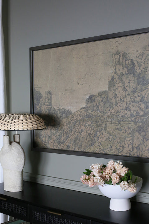
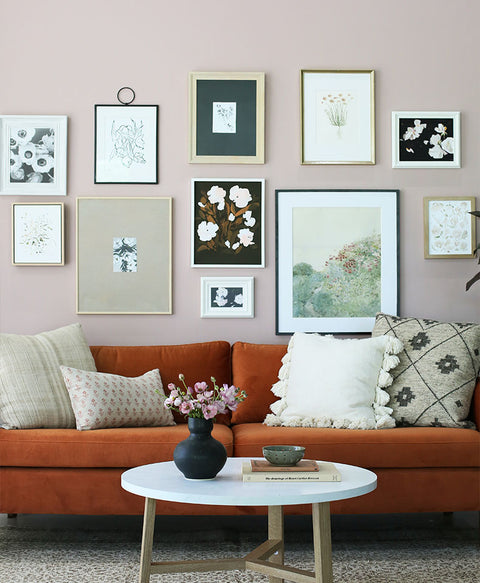
Let the art speak for itself- Consider the print that you are framing and how to compliment the tones and style of the work, instead of distracting from it. Does the art contain a lot of bold color? Consider a simpler wood, or black and white gallery frame. Ornate gold and silver leaf frames pair well with vintage art, but you can also create really cool contrast by pairing these vintage frames with a more modern print. Ask yourself what style you want this framed piece of art to evoke, and start there.

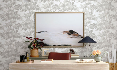
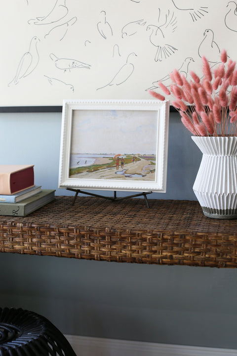
Pay attention to the room- Do you want a subtle frame that blends in with the rest of your decor? Try to match the undertones of the wall and furniture color. Does your space need more warmth? A rich wood toned frame, or warm metal can bring so much to a blank, cold space.
Consider visual weight- A thicker, more ornate frame will need to be balanced out by other elements in the room. Think of your walls like a scale- heavy visual weight on one side needs to be balanced out on the other. This can be done with more art, or plants and furniture.
Choose your Matting- Mat or no mat? That’s always a tricky question! Adding a simple white or neutral toned mat can completely change the look of a print, and add some dimension. Smaller prints matted to a large frame tend to draw the viewer closer in, while larger prints left unmatted create a more modern feel. Don’t be afraid to get creative with your mat color!
Have fun with it- While we can give you guidelines and tips, there are no set rules when it comes to the design world! Find a funky frame that speaks to you, paint your frame a fun and unique color, or experiment with your print and mat sizes. Art is about finding what speaks to you!


